
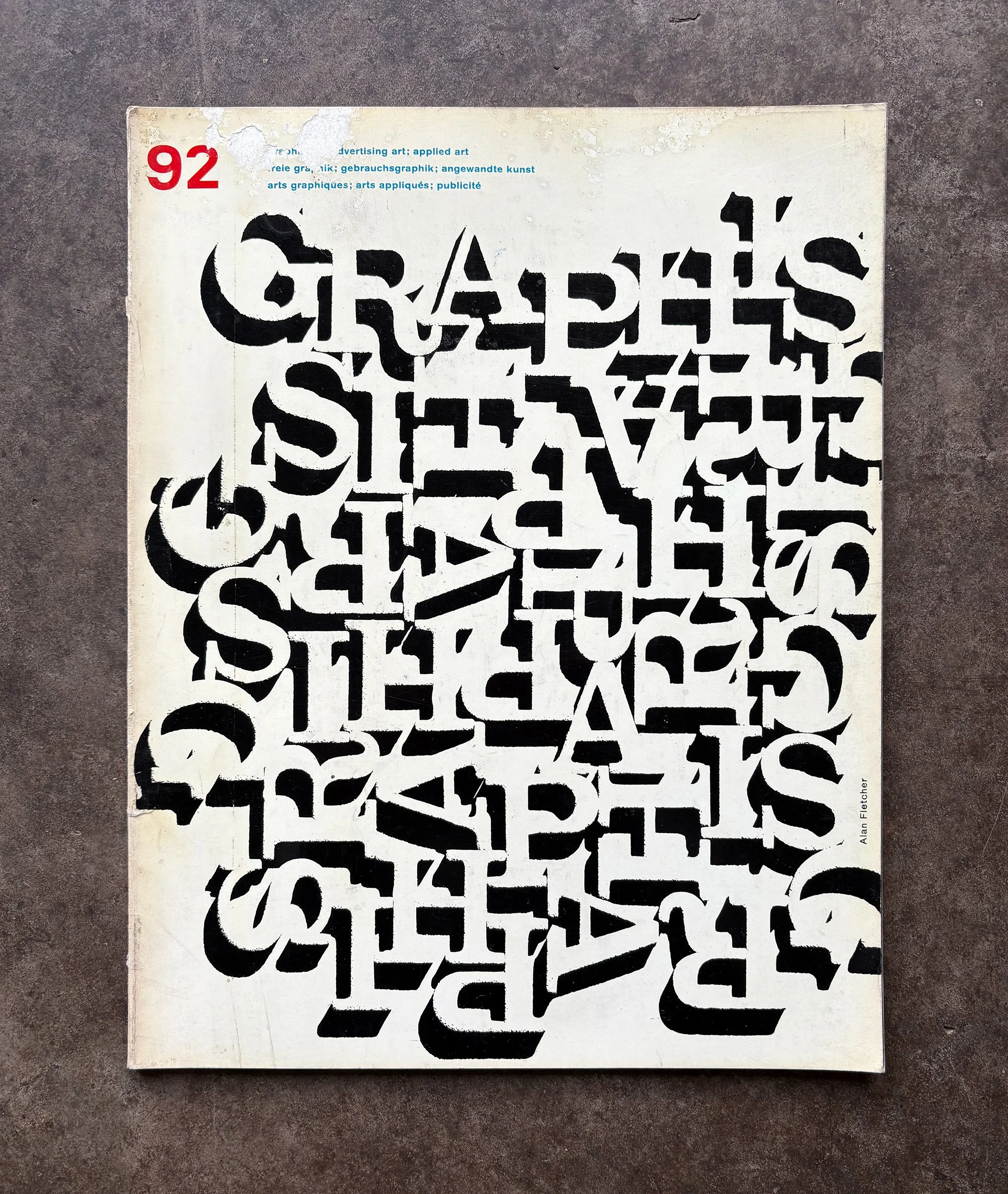
Graphis 92 — Japanese Posters
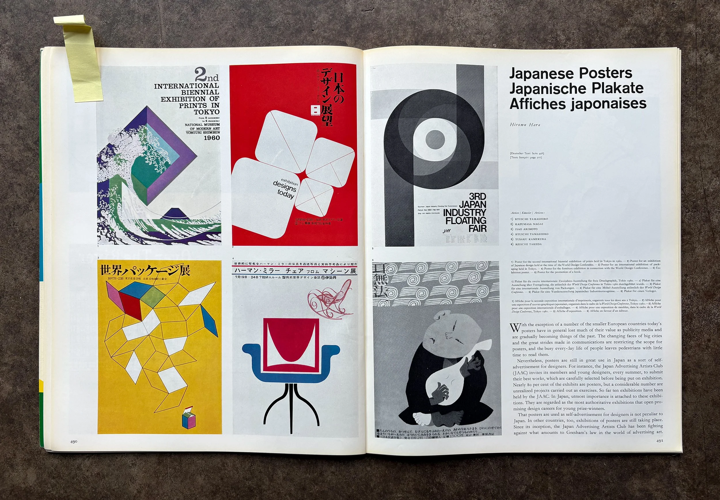
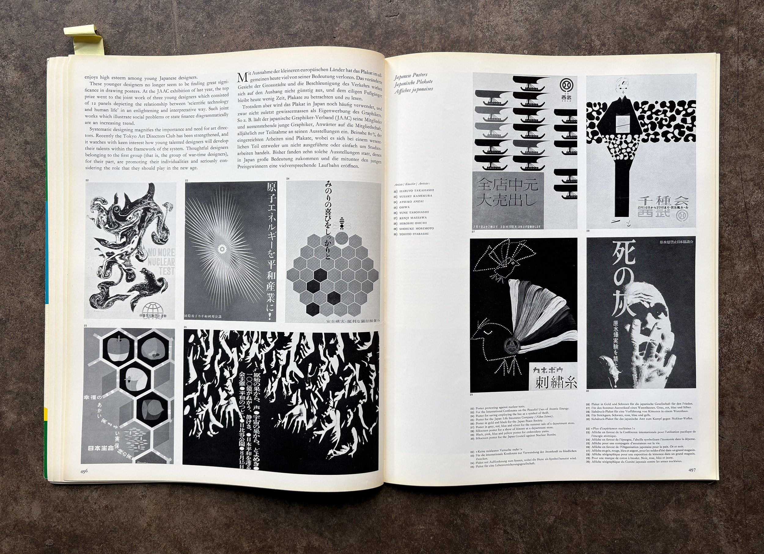
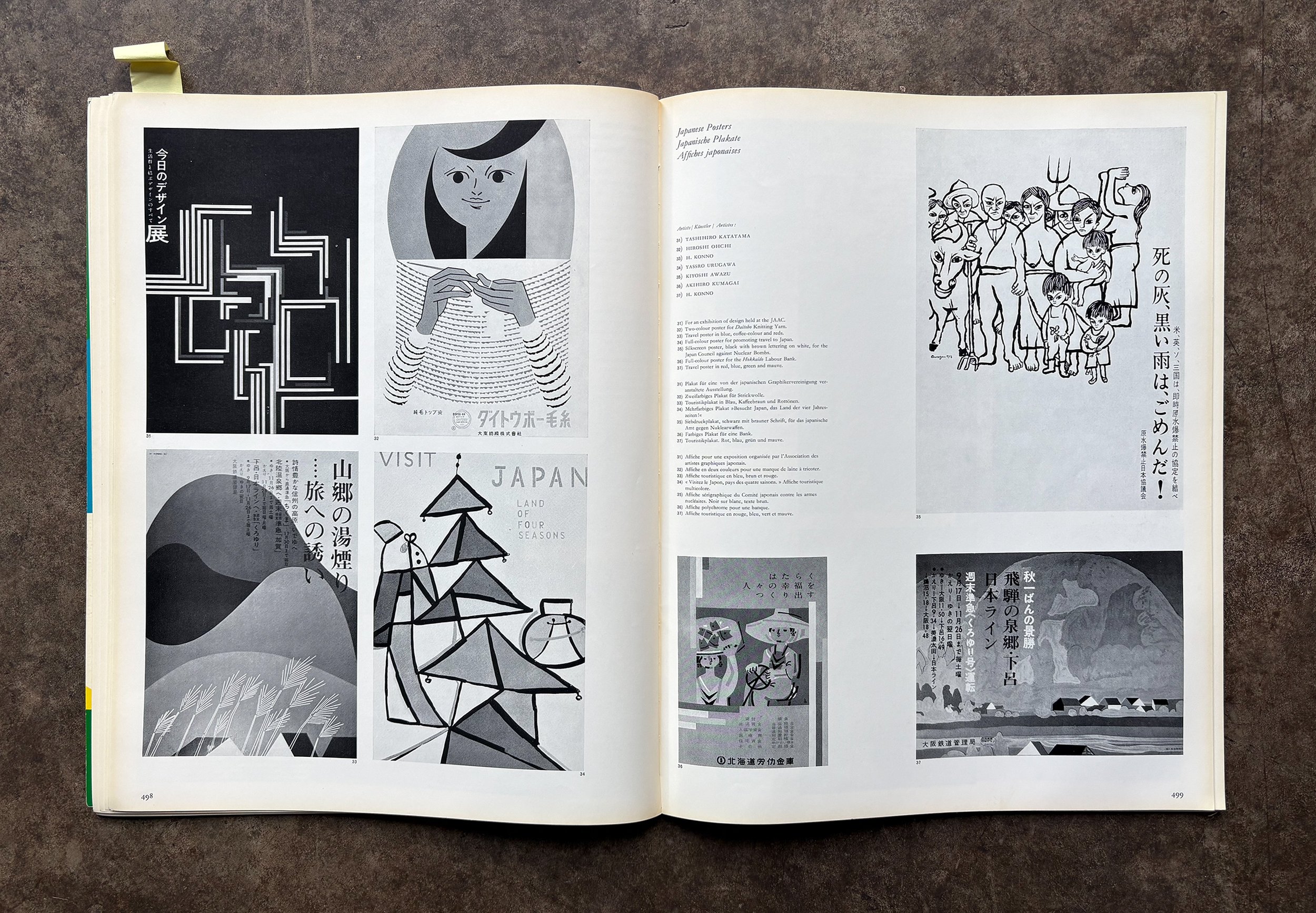
A spread from Graphis 92 documenting Japanese poster work at a moment when the medium still carried real cultural weight.
What stands out isn’t style—it’s control. Form reduced to essentials. Color used with intention. Space doing as much work as the image itself.
Even when expressive, nothing feels loose. Everything is decided.
You can see the range—geometric abstraction, playful composition, restrained typography—but it all holds together under a shared discipline. A kind of quiet authority.
Posters weren’t decoration. They were communication, built to be read, understood, and remembered.
Still some of the clearest thinking in graphic design.
Graphis 162 — Painted Walls
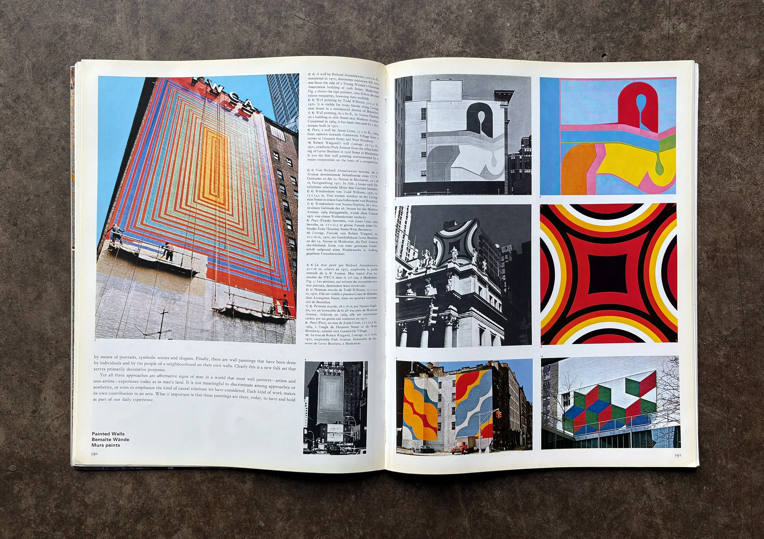
PAINTED WALLS
Before “public art” was a category, artists started using the city itself. Not galleries, not institutions—just walls. Big ones. Visible ones.
What stands out here is the intent. These weren’t decorations. They were direct. Scale used to be seen. Color used to interrupt. The building wasn’t a backdrop anymore—it was the work.
The article lands in that late ’60s to ’70s moment, especially in New York, where artists moved out into the street and started painting directly onto the sides of buildings. Sometimes commissioned, often not. It didn’t feel like permission—it felt like action.
Looking at it now, it’s clear how much changed. Art didn’t ask to be visited. It showed up where people already were.
Once that happens, a wall doesn’t go back to being just a wall.
Graphis 88 — Exhibition Posters by Artists
This section from Graphis 88 documents exhibition posters created by painters working in Paris—Chagall, Léger, and others.
The work is image-led, with minimal typography and no separation between fine art and applied communication. Each piece carries the artist’s hand directly into a functional context.
In school, art and design were treated as separate disciplines—one self-directed, one applied. This work doesn’t follow that distinction.
The artist defines the visual language and solves the problem at the same time.
That overlap is less common now.